 Currently on display in Wrexham’s Tŷ Pawb art venue is the Print International exhibition that ends on 24th January. Print is not something that I know anything about. Combining art and craft in a creative marriage of aesthetic refinement and technical skills, it has always seemed even more out of reach, physically as well as conceptually, than the more direct relationship between the artist and her/his brush and pencil on paper. All the teaching in traditional art history that I received back in the Jurassic seems to have left me more than somewhat ill-equipped to assess what print is all about. All the more reason to go and see a selection of different techniques and a variety of aesthetic concepts and approaches in a single exhibition.
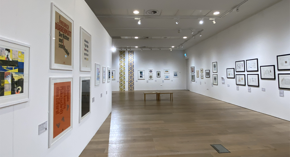
The gallery at Tŷ Pawb has been organized beautifully to display all the pieces to advantage, open and light-filled. Whether you are very familiar with print as a medium, or a complete novice like me, the Print International exhibition offers the opportunity to engage with an enjoyable and appealing series of bright, light, clean, art works, happily counteracting some of the more greyscale and muddy aspects of winter’s usual offering.

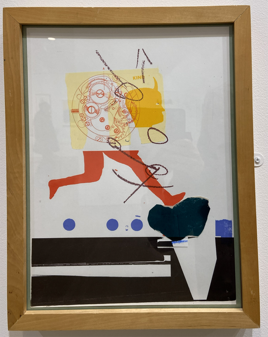
Andrew Wilson. Broken Clock. Copper photogravure
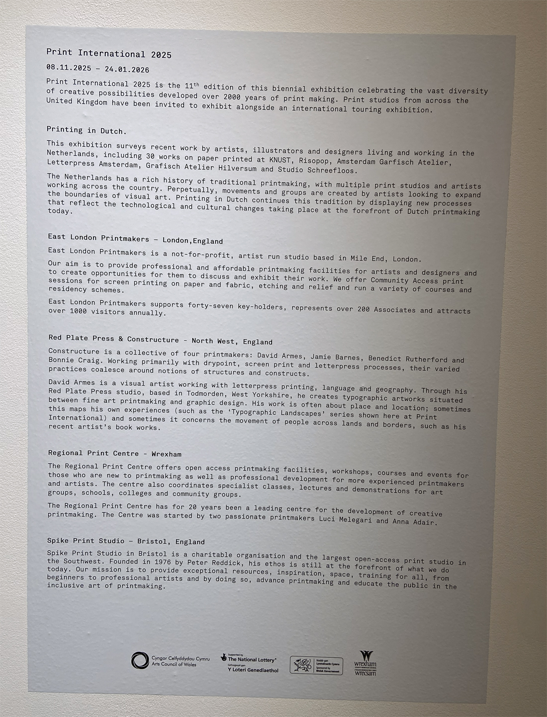
The exhibition was not about explaining print as an art form. The information boards described the different workshops and artists represented (see list at end), but chose to let the art works speak for themselves, which allows the viewer to assess each piece on its own visual merits, but does not help to demystify how the effects were achieved or why print may be just as powerful as a medium of expression as the more traditional and conventional forms of artistic output. Divorcing print from other types of artistic medium, however, concentrates the mind wonderfully on what this medium has to offer.
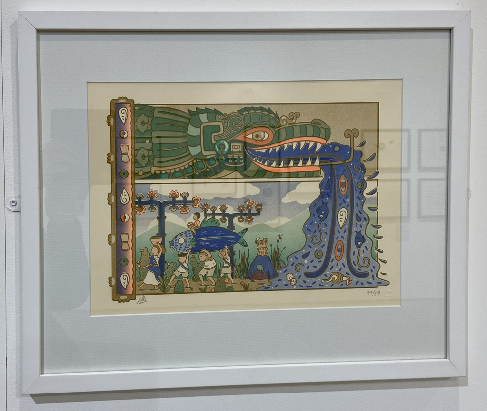
As the Wrexham-Chester area tips more firmly into winter, what was striking was how light-filled and bright the exhibition was, the perfect anecdote to seasonal murk and mire. It was the lightness of touch that struck me most in the prints on display, including the careful colouring, delicate and gentle in one corner of the room, bold planes of attention-grabbing colour in another, with plenty of stark and arresting monochrome to balance the brighter, lighter shades. Multiple textures were also on display, with flat surfaces of colour, heavy linearity, spidery filigree, tactile surfaces and subtle washes. Topics included the representational, pure pattern and pure abstract, and every combination in between. Very attractive experiments were made with text as an art form, as well as more conventional text- and icon-based posters. If you are familiar with printing techniques, there are plenty of different approaches of these on display too.
The photos below were taken on my smartphone, so are a bit feeble (it and I don’t seem to have a particularly empathetic relationship), and the reflections don’t do them many favours with my shadowy image in some of them, but hopefully give a sense of what’s on show. See more, with different prints from those below shown, on the Tŷ Pawb website, which also has details of opening times etc.
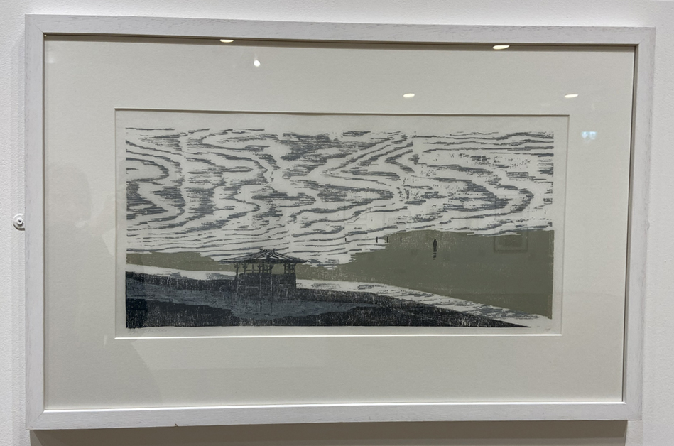
Martine Baldwin. Shelter. Woodcut
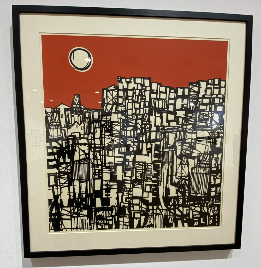
Paul Hogg. City. Screenprint

Tara Dean. New Growth (top) and From Here (bottom). Screenprint
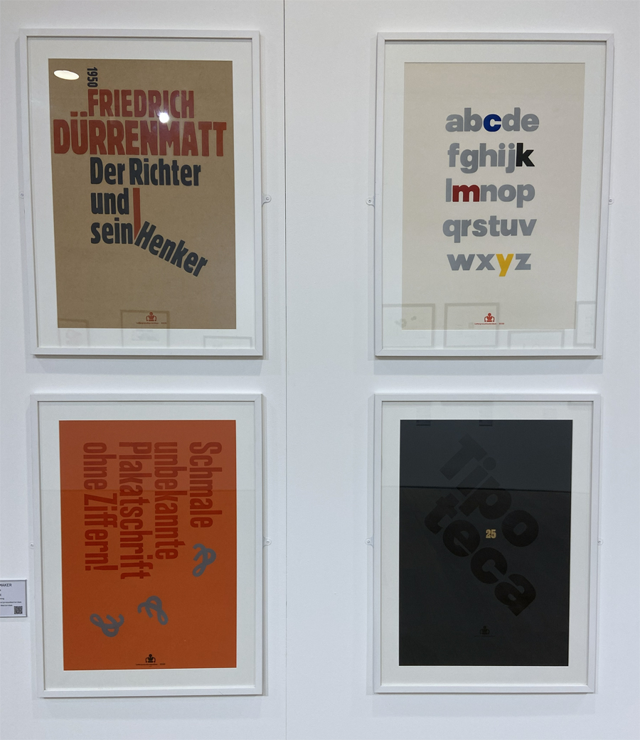
Thomas Gravemaker. Typographic Posters. Letterpress
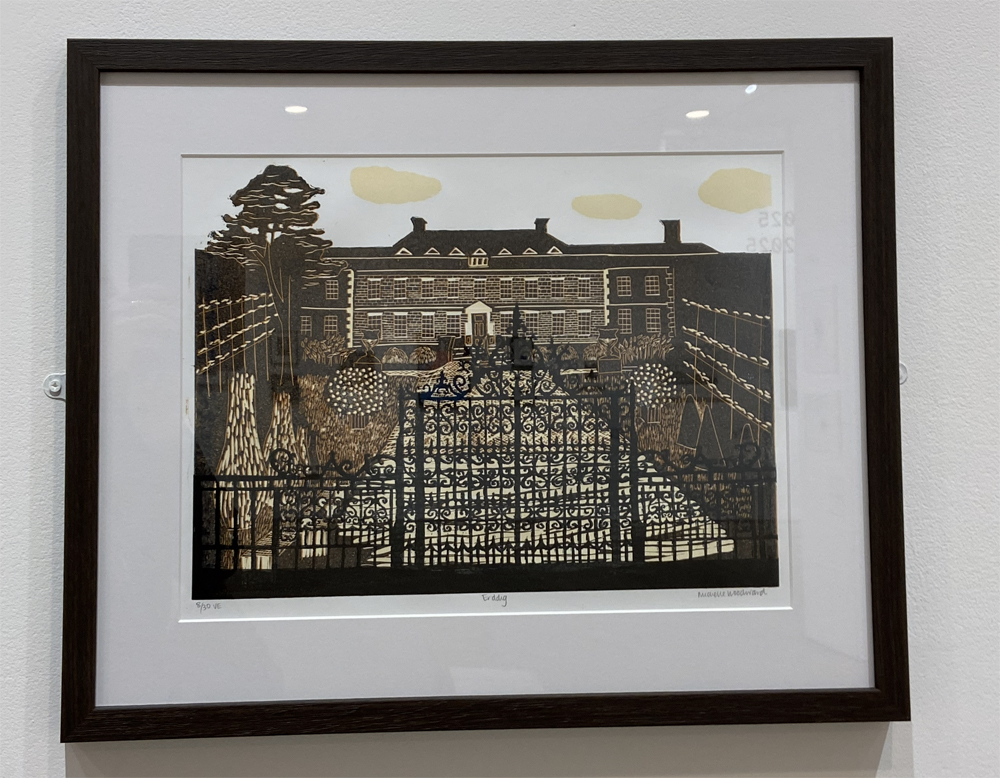
Michelle Woodward. Erddig. Lino print

Inga Eicaite. B-04. Etching
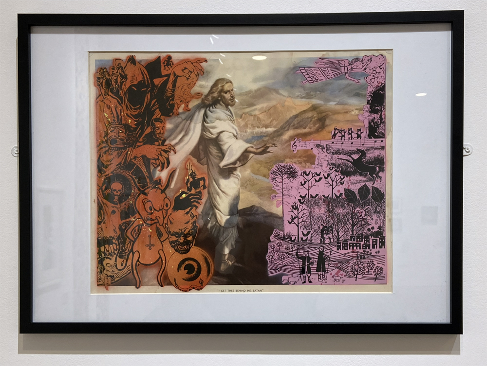
Matt Martin. Get Thee Behind Me Satan. Screen print and mixed media
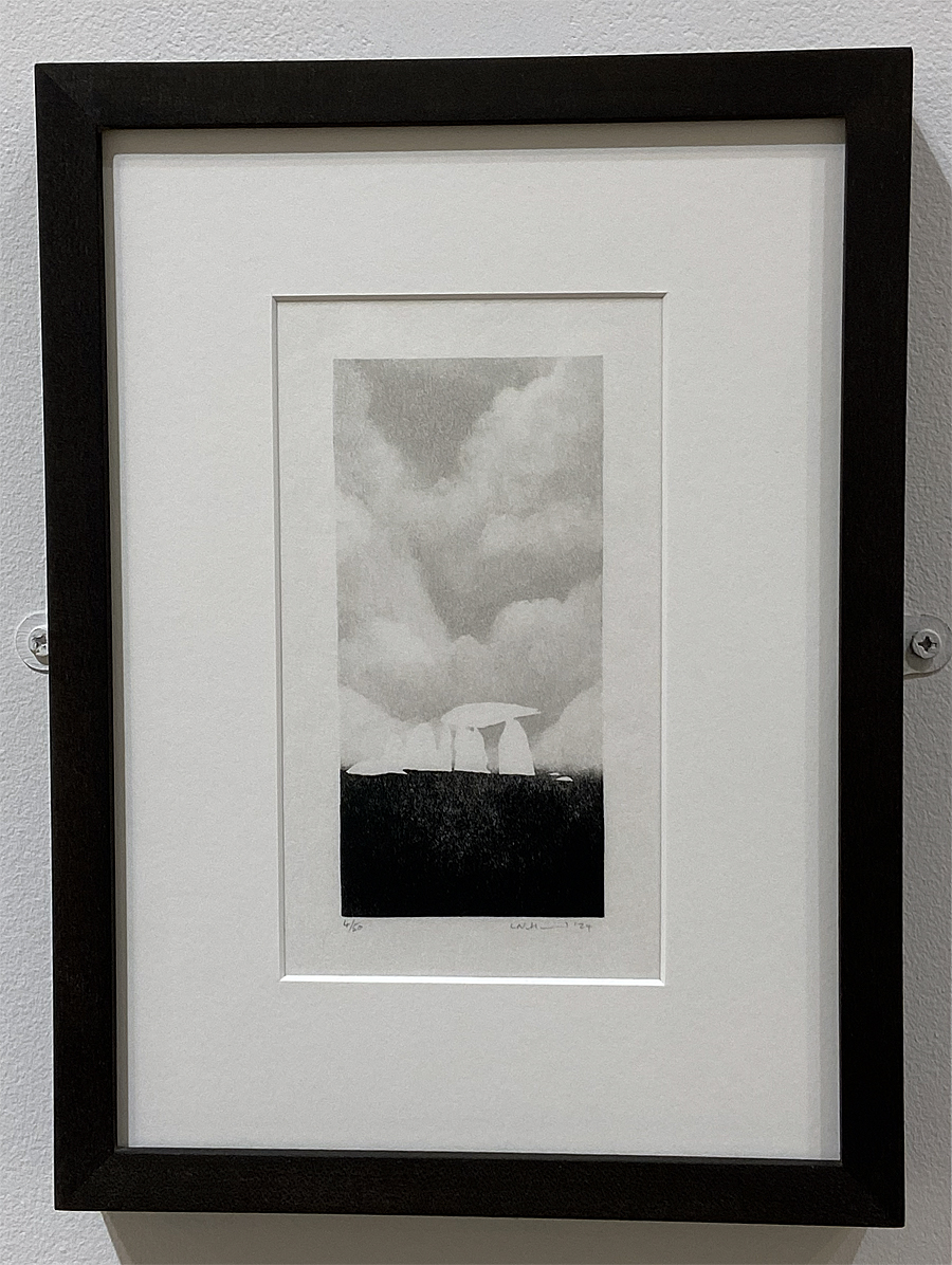
Lee Nutland. Skeletons I, Pentre Ifan. Copper photogravure

Nicola Scott. A touch of Eva n3a. Callagraph with watercolour
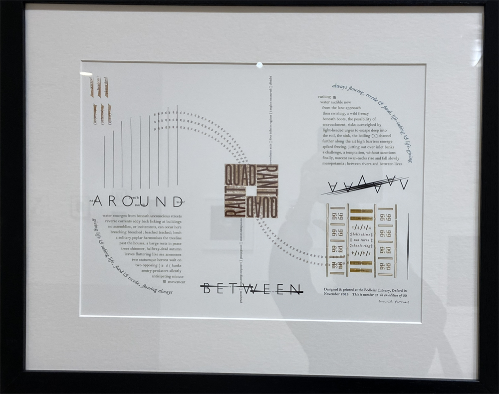
David Armes. Between Sun Turns. Letterpress
Aafke Metens. Deidad. Risograph